



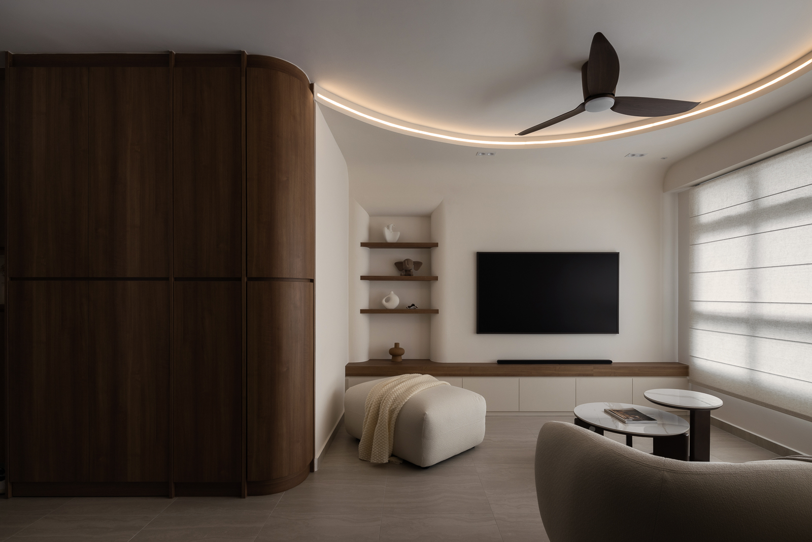
For years, Scandi interior design in Singapore meant the same formula: white walls, pale oak, grey accents. It’s a look we often design, and one many homeowners still love.
Recently, though, the brief we hear has shifted. Homeowners still want the calm of Scandinavian design, but with a warmer, more personal feel.
Classic Scandinavian interior design has built its identity on a fairly narrow palette: crisp white walls, pale ash or birch flooring, soft grey furnishings, and the occasional black accent. It photographed beautifully and suited Singapore’s tropical light, which is exactly why the look became so widespread through the 2010s and early 2020s.
That very popularity is part of what is now driving the shift. When a style becomes the default choice in showflats, renovation packages and furniture catalogues alike, it stops feeling considered and starts feeling generic.
Homeowners are asking for interiors that still feel calm and uncluttered, but distinct from every other Scandi flat they have walked through.

A few forces are converging at once. None of them is unique to Singapore, and yet every one is landing in local renovation choices this year.
None of this abandons Scandinavian principles. Function, simplicity and natural materials remain the foundation. What has changed is the palette and warmth of the materials sitting on top of it.
The easiest way to see the shift is side by side. Nothing here needs structural work, which is why this is an update most existing Scandi homes can make without a full renovation.
|
Element |
Cool Scandi |
Warm Scandi |
|
Wall colour |
Crisp white, cool grey |
Cream, warm beige, soft clay |
|
Wood tone |
Pale ash, birch |
Golden oak, walnut, teak |
|
Lighting |
Bright white, high colour temperature |
Warm white, around 3000K |
|
Textiles |
Grey wool, minimal pattern |
Linen, boucle, woven rattan |
|
Metal accents |
Matte black, chrome |
Brushed brass, bronze |
|
Surface finish |
Glossy laminate, high-gloss white |
Matte, textured, anti-fingerprint finishes |
The underlying thinking has not shifted. Homeowners still want light, uncluttered rooms built from honest materials. What has changed is that “light” no longer has to mean “cool.”

Our 33 Ghim Moh Link project shows this shift in practice. The homeowners came to us wanting a Scandinavian theme that leaned towards a warmer hue, not the crisp white-and-grey formula, but something softer and more lived-in.
Light wood tones set the base, layered with rattan pendant lighting and woven furnishings for texture. Rather than the usual white or cool grey, the living areas take on earthy dusty pink and soft green, while the bedrooms settle into a calming blush-and-cream palette. An arched feature wall in the living room adds a touch of architectural interest without breaking from the home’s clean, uncluttered feel.
It’s a good example of how little the warm Scandi shift actually asks of a floor plan. The bones, clean lines, function, and uncluttered storage stay Scandinavian. Only the palette and materials shift toward warmth.
For homeowners already living in a cool Scandi interior, most of this shift can happen through finishes alone.
The warm Scandi shift isn’t a rejection of Scandinavian design; it’s an evolution of it. The same commitment to function, natural materials and uncluttered space remains, but the palette has moved from cool and clinical to warm and lived-in.
For homeowners with an existing Scandi interior, the shift is often as simple as a change in wood tone, lighting and textiles.
If you are considering this shift for your own home, we would be happy to walk through your existing layout with you and show where a warmer palette could sit most naturally. Contact us to start the conversation.
They overlap, but are not identical. Japandi blends Japanese and Scandinavian principles with a stronger emphasis on darker woods, low-slung furniture and empty space, while warm Scandi is classic Scandinavian design with a warmer, earthier palette laid over the top. Many Singapore homes now sit somewhere between the two.
Yes. Repainting walls in a warmer neutral, swapping to warm white lighting, and adding a few pieces in richer wood or natural textile can shift the whole feel of a room. Structural changes are not required.
It works well. Warm neutrals like beige and sand reflect natural daylight gently rather than harshly, which softens the glare that stark white walls can sometimes create in a bright, sun-facing room.
Texture does more work here than colour. Linen, wool and rattan bring warmth while keeping a room visually calm, which is also why texture, not just colour, has become such a key part of this shift. We go into this in more detail in Why Textures Matter More Than Colours In Modern Interiors.
 BACK TO BLOG