COLOUR OF THE YEAR 2022
27 January 2022
TIPS & GUIDES
Colour (noun): an appearance perceived by us through the reflection/emission of different qualities of light
Colour is present in our daily lives; from our food to nature, furniture, and even our skin tone. It plays an important role in our lives, like helping us identify danger, differentiate our environment, increase memory performance, and many more. Not only do we feel its physical presence, but its emotional presence in how it affects our desires, perspectives, feelings, etc.
As we enter 2022, the third consecutive year we are living with the global pandemic, we are slowly easing into this new normal. Yet, in this tough time, more than ever, we seek to heal, to change, to express, and to move forward.
If you are looking to revamp your house or are finding inspiration for your future home, let us show you how the global colour authority, Pantone, and renowned paint brand, Dulux’s Colour of the Year, can bring new light to your abode.
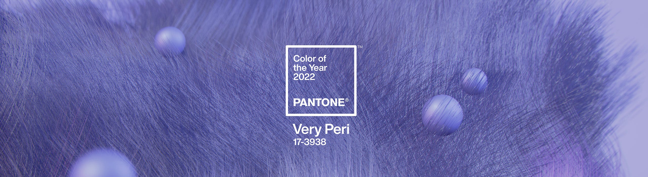
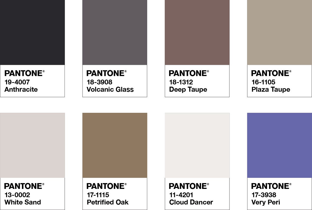
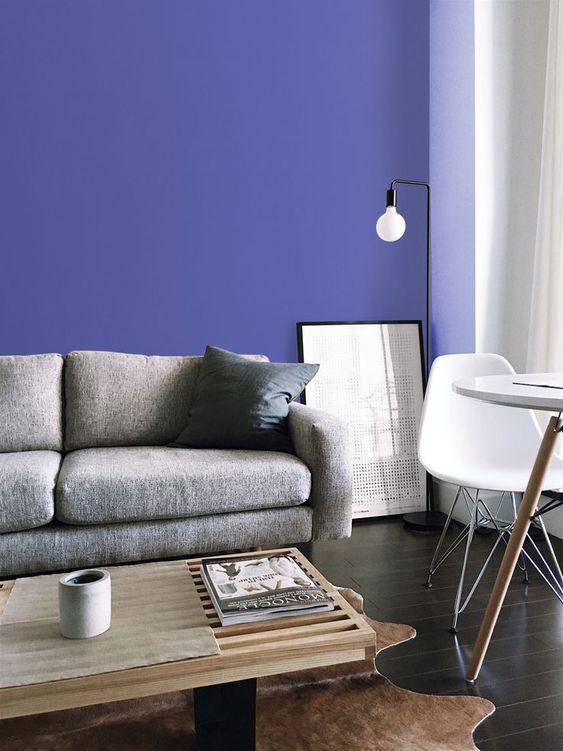
PANTONE COLOUR OF THE YEAR 2022 - VERY PERI
Credit: Pantone
This year, for the first time in Pantone’s 22 year history of “Colour of the Year”, they introduced their new colour creation, Very Peri, to reflect on these transformative times.
“As we move into a world of unprecedented change, the selection of PANTONE 17-3938 Very Peri brings a novel perspective and vision of the trusted and beloved blue colour family, encompassing the qualities of the blues, yet at the same time possessing a violet-red undertone, PANTONE 17-3938 Very Peri displays a spritely, joyous attitude and dynamic presence that encourages courageous creativity and imaginative expression.” – Leatrice Eiseman, Executive Director, Pantone Colour Institute
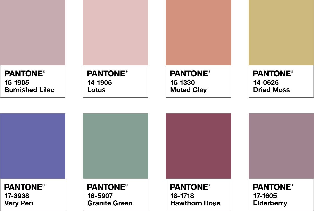
Having the calm qualities of blue hues and expressiveness of red hues, Very Peri introduces a new form of expression – unique and impressionable. Let’s take a look at how you can incorporate this colour into your home.
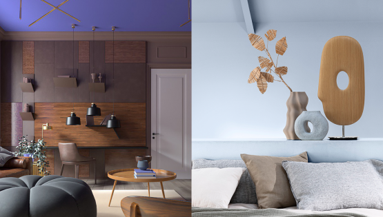
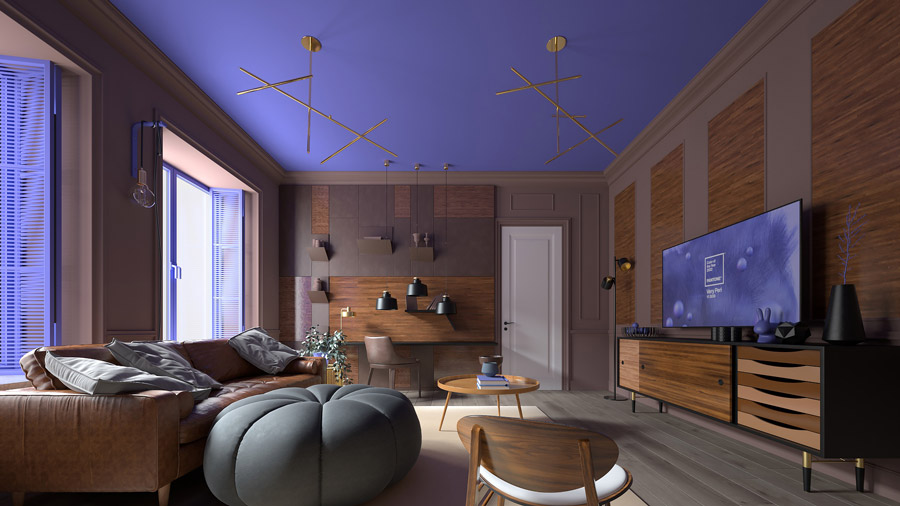
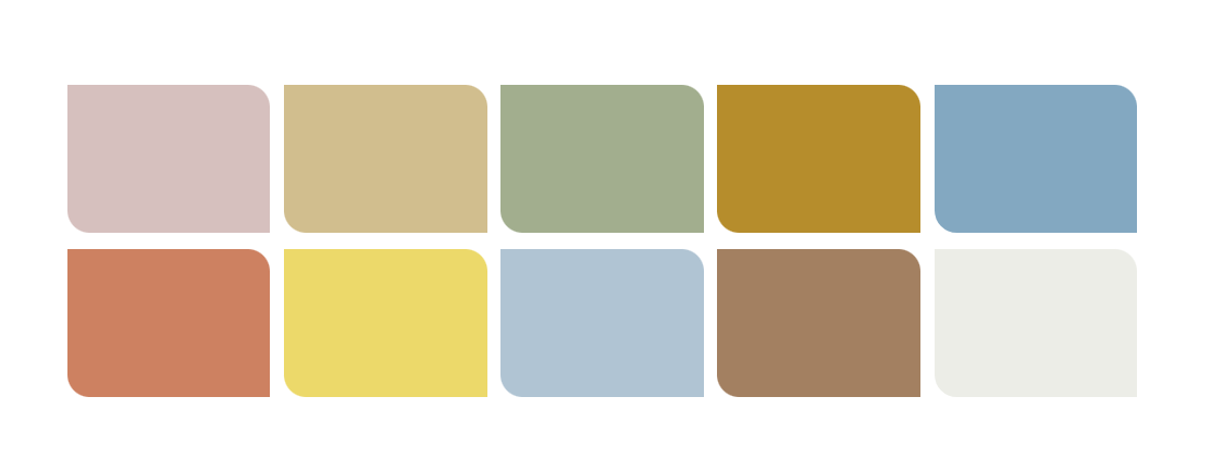
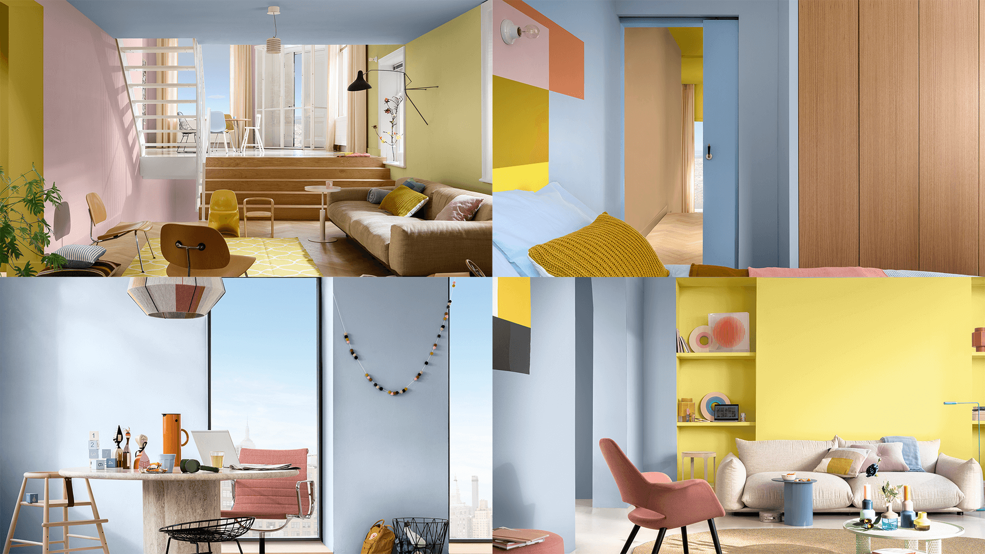
COLOUR PALETTE 1: BALANCING ACT
Credit: Pantone
Balancing Act is a complementary colour palette that balances warm and cool tones. It impacts the viewer’s visual perspective at first sight while livening the space with its unusual colour theme.
Credit: Microsoft Design
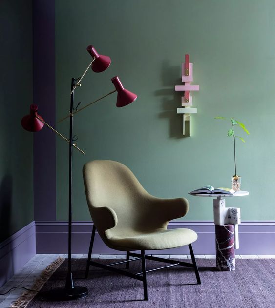
Credit: Casa Vogue
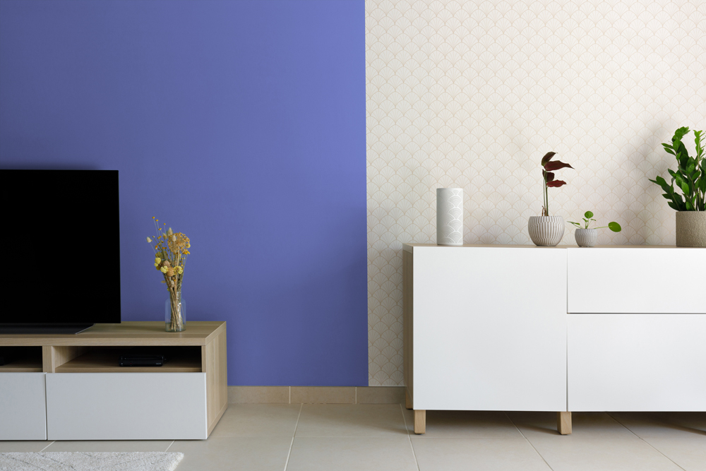
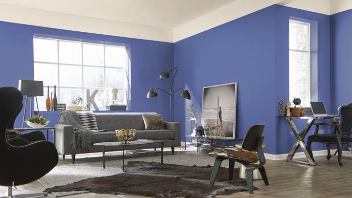
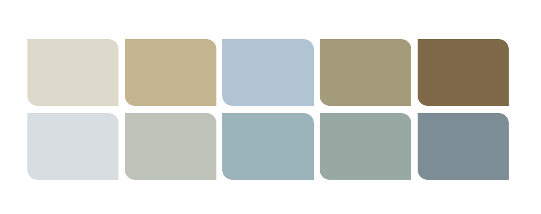
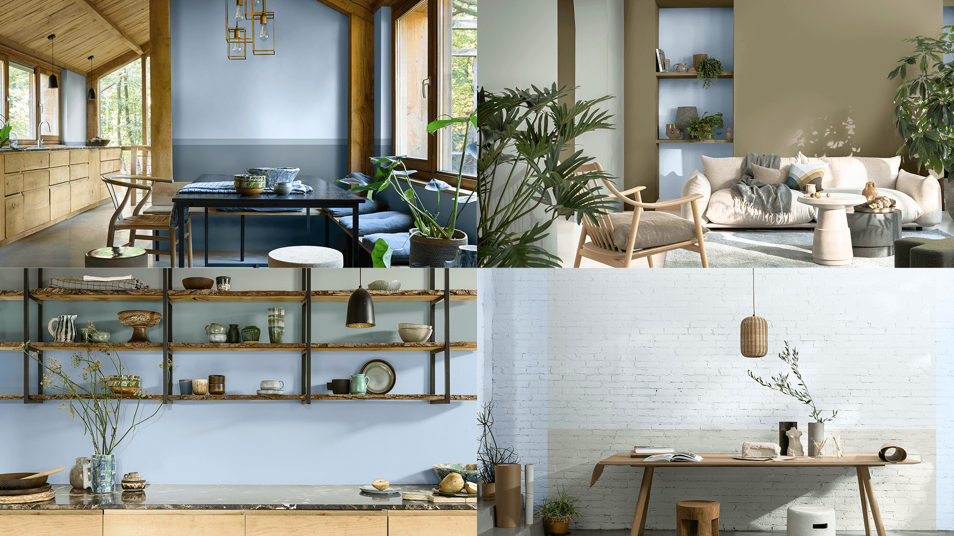
COLOUR PALETTE 2: THE STAR OF THE SHOW
Credit: Pantone
Pairing the new Very Peri colour with neutral shades, this colour palette exudes a sense of elegance and subtle stylishness, putting across the message of timeless sophistication.
Credit: Tollens
Credit: Sherwin-Williams
Credit: Tollens
If you have completed your home renovation or are already in the midst of it, a change to the overall colour scheme may not be entirely feasible. Consider small additions to your space instead, such as furniture, soft furnishing or even decorative pieces.
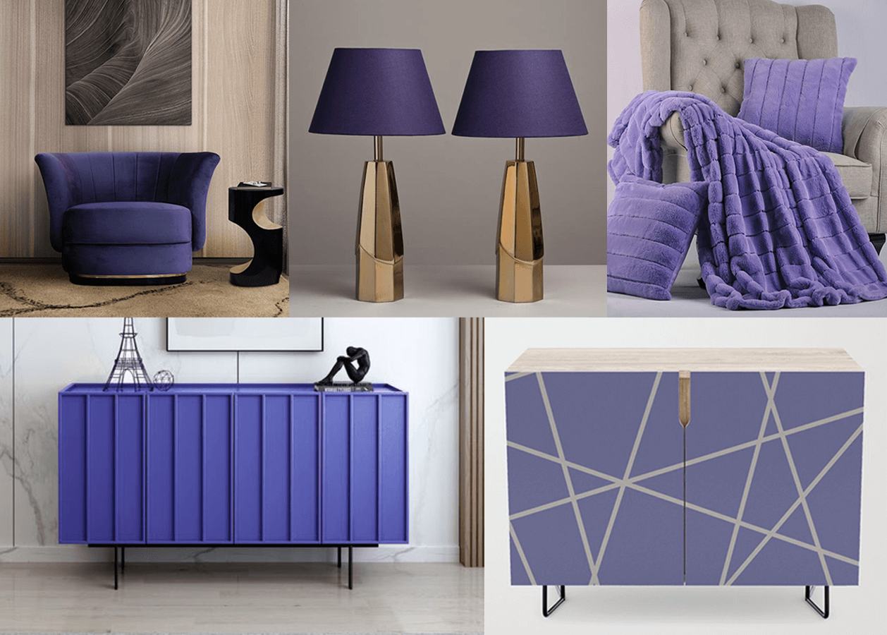
Credit: Brabbu | Confettistyle | Wayfair | Hoare Group | Society6
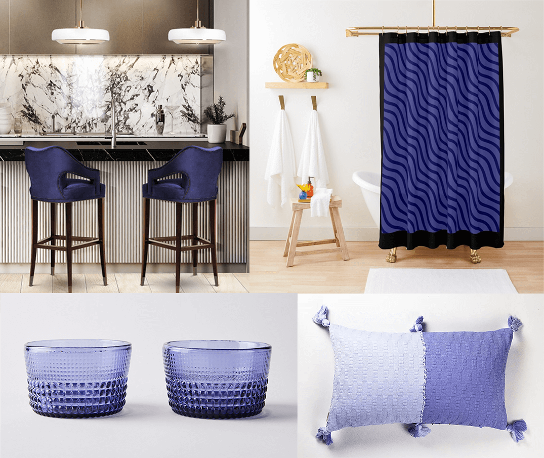
Credit: Home Society | Redbubble | Food52 | Anthropologie
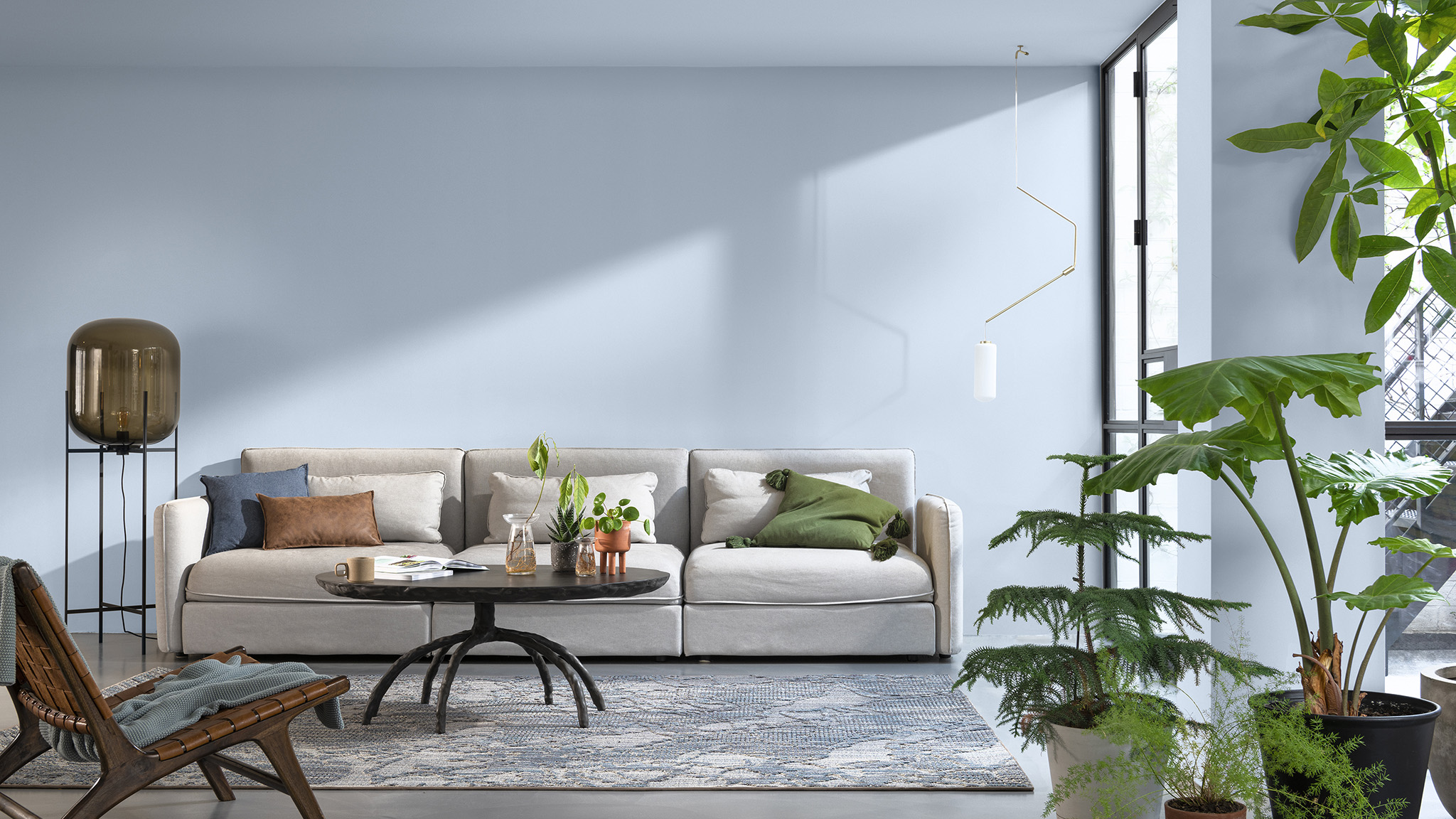
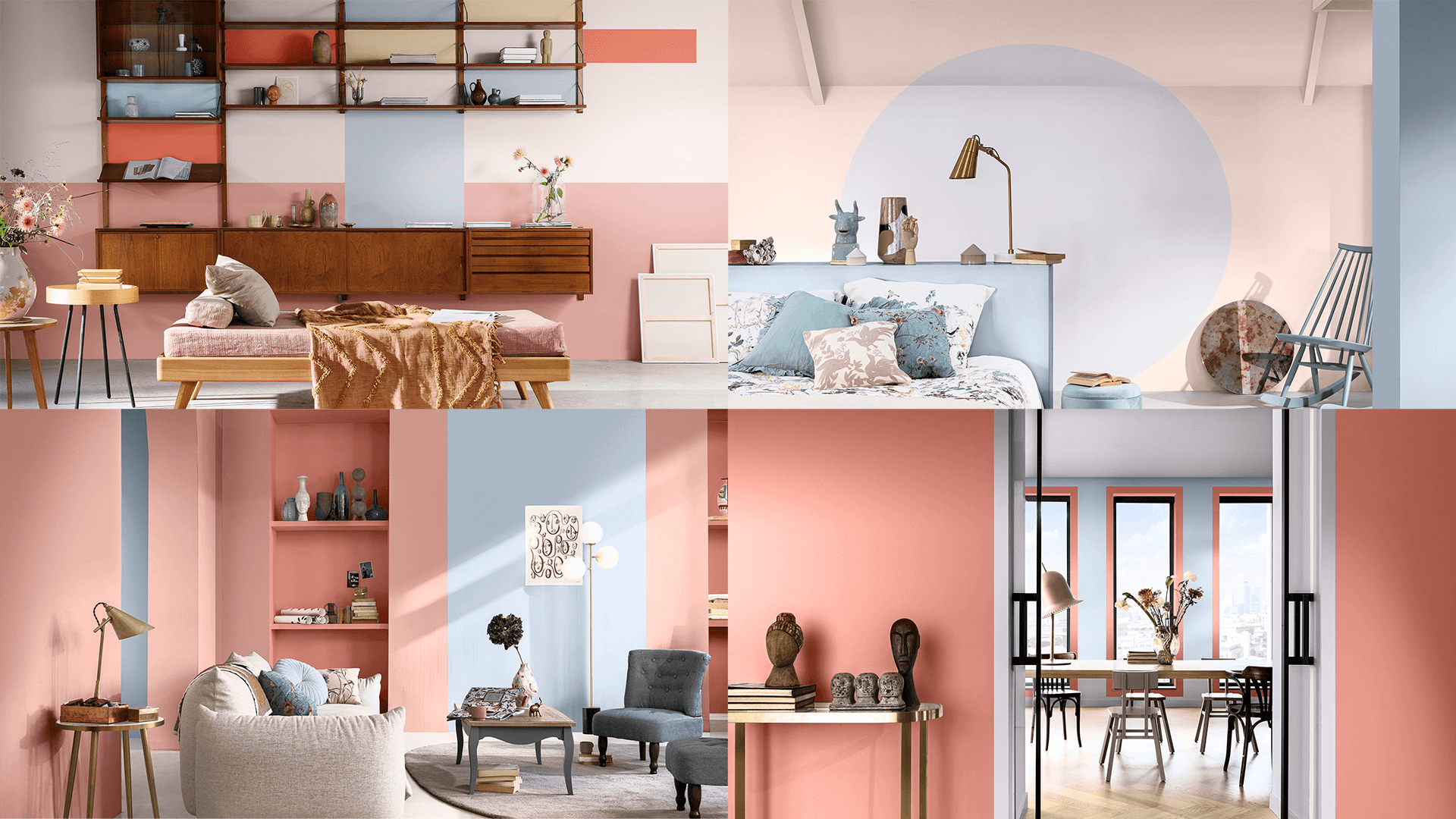
DULUX COLOUR OF THE YEAR 2022 - BRIGHT SKIES
Credit: Dulux Singapore
Through a 3-days long discussion with International Design Experts, where topics such as learning the mood of the moment and how our lives are impacted in the past year were discussed. Gathering these insights and observations, Dulux has derived their Colour of the Year 2022: Bright Skies.
It’s a colour of optimism, freedom and rejuvenation. Just like its name, it is as though you are bringing fresh air and Bright Skies into your home. According to Marianne Shillingford, Creative Director of Dulux, Bright Skies is also a receding colour – a colour that makes small spaces look spacious. With the increase of smaller BTO spaces in Singapore, Bright Skies can be a colour of choice for that wide and airy look.
COLOUR PALETTE 1: THE WORKSHOP PALETTE
Credit: Dulux Singapore
“Use multicoloured shades to create joyful, fresh and flexible spaces where you can do it all.” – Dulux
Credit: Dulux Singapore
Introducing a vast spectrum of colours, Dulux’s Workshop Colour Palette is both playful and refreshing. This multicoloured palette brings splashes of colour into your space. It’s great for segregating spaces, creating accent walls or crafting an inspirational backdrop in your home.
COLOUR PALETTE 2: THE GREENHOUSE PALETTE
Credit: Dulux Singapore
“Bring in the benefits of the great outdoors with fresh natural tones inspired by nature.” – Dulux
Credit: Dulux Singapore
Bringing nature into the comfort of your home, the Greenhouse Palette is a great pairing with natural elements like plants, wooden furniture, rattan chairs, etc. The colours are gentler to the eyes and great for Scandinavian, Tropical or Biophilic design themes.
COLOUR PALETTE 3: THE STUDIO PALETTE

Credit: Dulux Singapore
“Escape the everyday, recharge and feel inspired with consoling tones that soothe the soul.” – Dulux
Credit: Dulux Singapore
Unlike the pops of colour in the Workshop Palette, the Studio Palette carries a more mature tone. For individuals who live and breathe creativity, this palette of colours can perhaps provide inspiration, or simply be a statement of your individuality.
There are many more shades other than the classic colours of the rainbow. Seeking the shade of colour that suits and communicates your design vision can be a long process. This article is but a small introduction to new shades and palettes you can consider. Be bold, and go for different shades of colour that you may have always wanted to include in your very own home!
CONSULT OUR DESIGNER
-
3 June 2026 TIPS & GUIDES
Designing the Perfect Kitchen: Layouts, Materials, and Practical Tips for Modern Homes
-
15 May 2026 DESIGN INSPIRATION
Why Textures Matter More Than Colours In Modern Interiors
-
14 May 2026 DESIGN INSPIRATION
Built-In Wardrobes for Condo Bedrooms: Sliding, Hinged, or Walk-In?
-
13 May 2026 TIPS & GUIDES
Planning an Oriental or Peranakan Home in Singapore? Ask Your Interior Designer These Questions First
-
7 May 2026 DESIGN INSPIRATION
The Oriental Renovation That Doesn’t Feel Dated: What Designers Are Doing Differently Now