



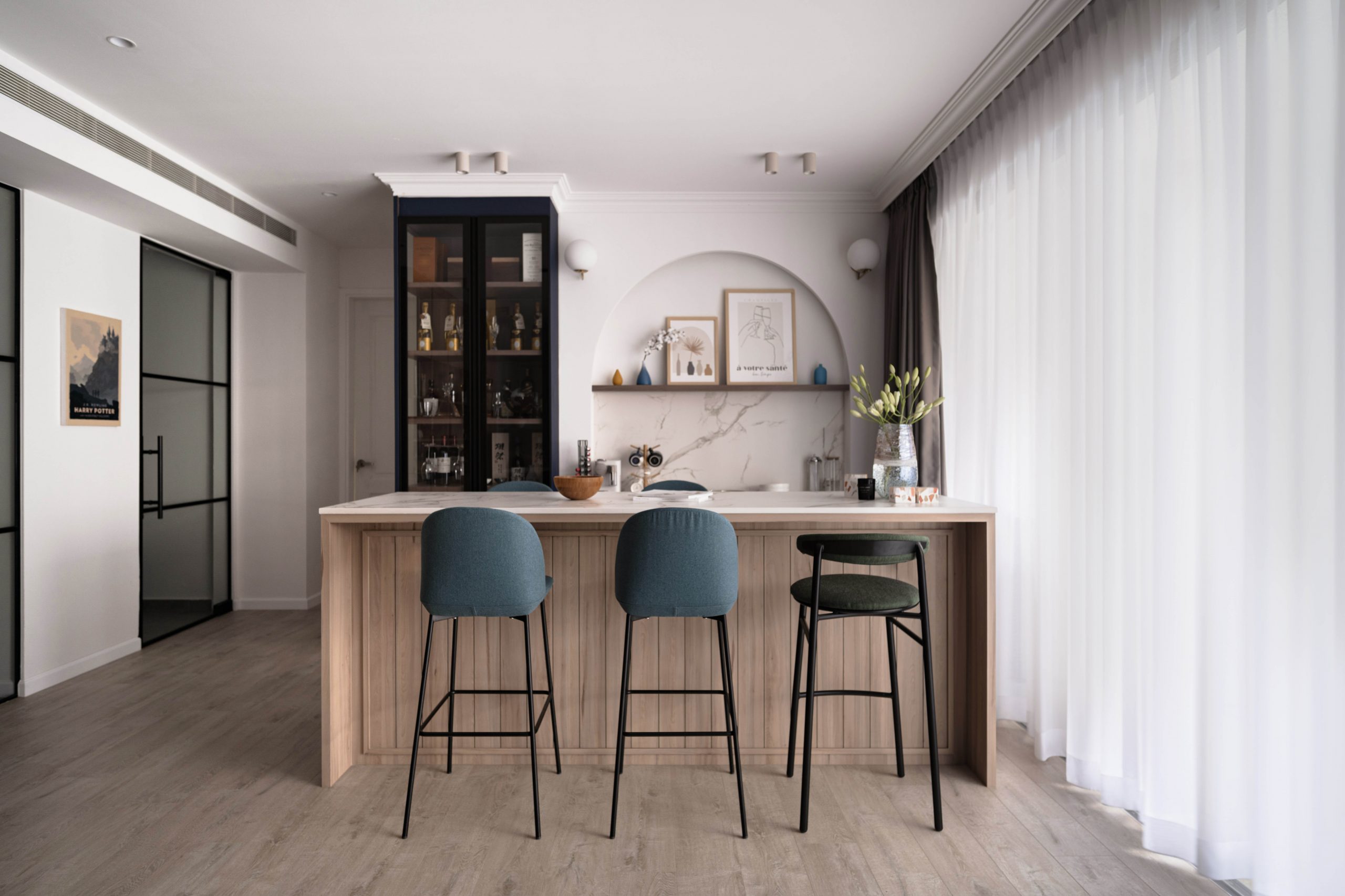
Most condo owners in Singapore assume that a more spacious home means a bigger renovation bill, or worse, hacking into a wall. It rarely does.
After years of working within Singapore’s compact floor plans, we have found that great condo interior design comes down to how a space is lit, viewed, and stored, far more than how many square metres it holds.
It isn’t in your head. Under URA’s planning guidelines, new private residential developments outside the Central Area are capped at one dwelling unit for every 85 square metres of gross floor area. This divisor was tightened from 100 square metres in earlier years, which is part of why average unit sizes have been trending downward.
Newer units are also more likely to combine living, dining and study zones into a single open area, which means every design decision in that space has to earn its place.
The good news is that a smaller footprint doesn’t have to read as a smaller home. Spatial perception is shaped by what the eye can see and how far it can travel uninterrupted, not by the number on the floor plan.

Stand at your front door and look straight ahead. Whatever your eye lands on first sets the tone for the entire unit. If it’s a wall, a stack of shoes or the back of a cabinet, the space feels boxed in before you’ve taken a step inside.
The fix is to design a clear line of sight from the entrance towards a window, balcony or the furthest wall in the unit. A few habits support this:
This is also why open-plan layouts work so well in smaller condos. Removing a non-structural wall between the kitchen and living area extends the sightline by several metres, which the eye reads as significantly more space, and in many units it improves cross-ventilation too.
A single ceiling light flattens a room. It lights the centre and leaves the corners in shadow, making the room’s true edges harder to read and making the space feel smaller than it is. Layering light sources gives the eye more to work with and pushes the room’s visual boundary outward.
|
Lighting Layer |
Purpose |
Where It Works Best |
|
Ambient |
Even overall illumination |
Ceiling coves, recessed downlights |
|
Task |
Focused light for specific activities |
Under-cabinet strips, reading lamps |
|
Accent |
Highlights a feature and adds depth |
Wall washers, cove lighting behind a TV console |
|
Uplighting |
Draws the eye toward the ceiling |
Along the perimeter of a living or bedroom |
A warm white at around 3000K tends to feel more welcoming in living and bedroom areas, while a slightly cooler tone at around 4000K works better over kitchen counters, where task visibility matters more.
Whatever the mix, the goal is the same: no single point in the room should sit in shadow, and no single fixture should be doing all the work.

Loose furniture is one of the biggest culprits behind a cluttered-looking condo. Free-standing wardrobes, shoe cabinets and bookshelves all interrupt sightlines and encroach on walkway space.
Built-ins solve this by running storage from floor to ceiling and flush against the wall, so the room reads as one continuous surface rather than a series of separate objects competing for attention.
In our Skyline Residences II project, we built a curved arch into the living room cabinetry as a cosy lounging spot for the homeowners’ dog, while a separate arch feature wall, clad in a stone-like texture, adds depth and dimension to the space.
A few principles we return to often:
Beyond lighting, sightlines and storage, a few finishing touches reinforce the illusion of space:
None of these requires structural work. They’re finishing decisions, which is exactly why they’re often the most overlooked part of a renovation.
A condo’s floor area is fixed the day you collect your keys, but how spacious it feels never has to be. Layered lighting removes shadows and adds visual volume; clear sightlines let the eye travel farther than the walls suggest; and built-ins clear the clutter that shrinks a room in the first place. Together, these choices do more for a home’s sense of scale than any wall removal could.
If you would like a fresh take on your condo interior design and to see how these principles work with your layout, our team at The Interior Lab would be happy to walk through your floor plan and show you where the space really lives.
Get in touch with us to start the conversation.
Wall removal can only be done if the wall is non-structural. Opening up a kitchen or dining area does extend sightlines and can improve cross-ventilation, but always confirm with your contractor or the building’s Management Corporation Strata Title (MCST) before any hacking, since load-bearing walls and utility risers cannot be touched.
Lighting. Swapping a single ceiling light for a layered mix of ambient, task and accent lighting can change how a room reads within days, without any carpentry or structural work.
Built-ins are usually the better long-term choice for compact units. They run floor-to-ceiling and sit flush against the wall, so they hold more than a free-standing wardrobe with the same footprint while keeping sightlines and walkways clear.
Not necessarily. A darker accent wall or cabinetry tone can work well when paired with strong lighting and a lighter surrounding palette. The issue isn’t dark colour itself but a lack of light layering to balance it.
 BACK TO BLOG