Scandinavian Interior Designs Don’t Have to Be Pale: How to Embrace Colour the Right Way
24 December 2025
TIPS & GUIDES
Scandinavian interior design has long been associated with pale wood, neutral tones, and a minimalist look. While this approach delivers clean lines, airy interiors, and a calm, understated elegance, it can sometimes feel a little too monochromatic.
Adding colour to a Scandinavian interior design doesn’t mean giving up what you love about the style. With a few thoughtful choices, you can bring in personality, vibrancy, and warmth while still keeping that modern Scandi look.
Key Takeaways
- Scandinavian interior design focuses on simplicity, clean lines, natural materials, and neutral tones. Large windows, light wood, and bright, airy interiors are hallmarks of the style.
- Colour can be introduced without compromising the Scandinavian look. Strategic use of contrasting, analogous, or triadic colour palettes adds depth and personality.
- Biophilic elements, such as plants, woven baskets, and natural textures, bring life, warmth, and visual interest to the space.
- Layering lighting (e.g., ambient, accent, and task light) enhances colours, highlights design features, and allows flexibility in setting the atmosphere.
- When colour, texture, and lighting are planned together, a Scandinavian interior stays functional, inviting, and visually calm.
- Consulting an interior designer can help balance bolder elements with a classic Scandinavian base, and optimise the layout and functionality of your space.
What is Scandinavian Interior Design?
Scandinavian interior design style originated in the Nordic countries, where homes are shaped by climate, lifestyle, and a love for simplicity. It draws inspiration from nature, incorporating wooden accents and biophilic elements, bringing the warmth of the outdoors in.
Large windows allow natural light to fill the space, while natural wood tones dominate the furniture. Neutral palettes, such as off-white or white walls, create a calm backdrop for the rustic characteristics of the Scandinavian style.
Plush textiles, woven baskets, and greenery are also characteristic of Scandinavian style, bringing more of the outside world’s natural elements into our indoor everyday life. Scandinavian design’s goal is to create a bright, airy interior that prioritises well-being, functionality, and aesthetic harmony.
Tips for Achieving Vibrant Scandinavian Interior Design
Because of this design direction, some people may find Scandinavian interior design to be too wooden or bland. However, we’ve curated a few tips on how you can make your interior pop, achieving the perfect balance between natural and modern, for your nature-inspired house.
Use Biophilic Elements

Introducing natural materials like wood, stone, and greenery immediately adds colour and texture to a Scandinavian home. The above project takes it a step further by using glass partitions to make a space feel more airy and open.
You can also consider:
- Houseplants and potted centrepieces add fresh green tones to a brown or neutral scheme. The cool green balances the warmth of wood and helps the space feel lively.
- Woven baskets provide a storage solution that’s cohesive with the Scandinavian design scheme. They keep clutter tucked away while complementing wood furniture and flooring.
- Textured fabrics such as curtains, throws, and rugs in linen, cotton, or wool to soften the space. These can take on more vibrant colours, not just neutral hues, to help accent against the dominant brown, adding a subtle Bohemian touch.
Biophilic elements are a hallmark of Scandinavian nature-rooted design, balancing and harmonising colours and textures. If you want a more vibrant but still grounded Scandi home, greenery and natural textures are a safe place to start.
Mix Warm and Neutral Light

Lighting shapes the mood of any interior. While Scandinavian-inspired homes often lean towards warm light for a cosy feel, having both warm and neutral lighting gives you more control over the mood of the room.
Colours will appear different under different light temperatures. A shade of green will have a different hue under warm light, neutral light, and daylight. So having both warm and neutral lights helps bring out different tones in your existing colour scheme.
Utilise Ambient, Accent, and Task Lighting

Different layers of lighting serve distinct purposes in interiors.
- Ambient lighting brightens the whole room
- Accent lighting highlights décor or architectural features. They could also serve as mood lighting, creating a softer, cosier atmosphere.
- Task lighting has a functional purpose, providing occupants with illumination for chores and tasks, such as cooking. These are ideally a bright, cool white—more for visual clarity than design.
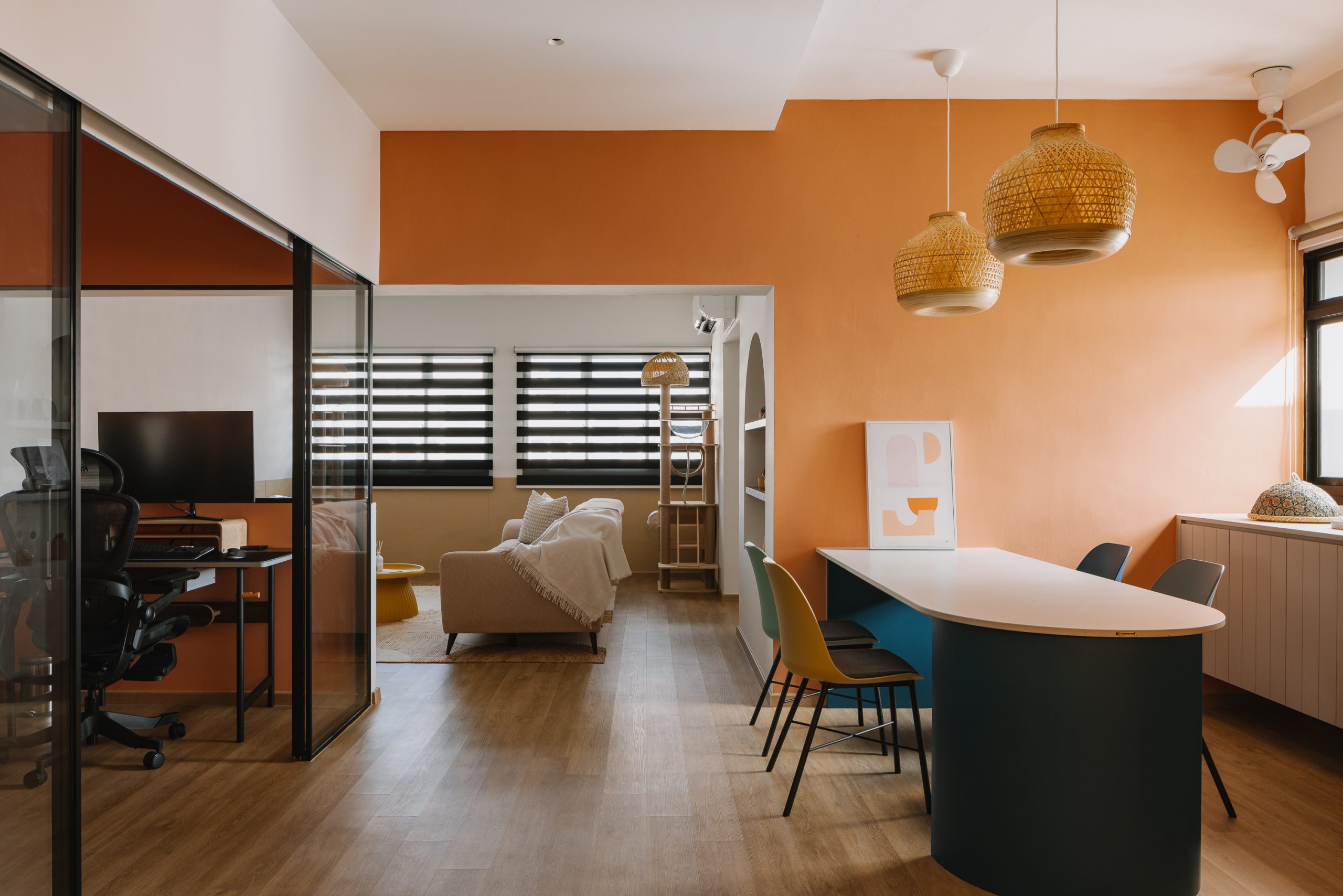
Notice how the image above features neutral white ambient light and a window in the dining room letting in natural light. To contrast the neutral illumination, the room also features a light fixture providing warm accent light above the dining area and another warm accent light that contours the cabinet. Having these choices allows for different lighting configurations, allowing homeowners to customise their lighting setups.
By using accent lighting on wall-hung paintings, for example, homeowners can dim their ambient light without losing the colour that the paintings introduce to the room. It gives occupants tremendous flexibility in curating the colours and atmosphere of their space.
Note that installing lighting will require electrical and interior design coordination. Get in touch with The Interior Lab and let’s discuss how you want your lighting to be configured.
Throw In a Splash of Colour
Scandi interior design doesn’t have to be all brown, pale wood, and neutral hues. Introducing colour strategically creates visual interest and elevates the furniture and décor without compromising the clean, functional style.
A sofa, cushions, artwork, or a rug in the right colour can instantly lift a neutral Scandinavian interior. Here are some easy ways to build a palette:
Warm–Cool Contrast (Nature Greens)

Cool, nature-inspired greens like sage and forest green pair beautifully with warm wood tones. The greens act as a calm, cool counterpoint to the kitchen’s warmer timber and caramel hues, creating a grounded, forest-like palette.
Notice how in the image above, the forest cabinets complement the wooden chairs, countertop, flooring, and feature lights to set a forest scheme for the kitchen.
These colours are perfect for:
- Kitchen cabinets
- Feature walls
- Dining chairs or bar stools
Analogous Colours

Earth tones such as beige, tan, camel, rust, terracotta, mustard, and olive green bring out the wooden accents of the Scandinavian look.
They are ideal for:
- Rugs and cushions
- TV feature walls
- Loose furniture like armchairs or ottomans
These colours add depth to the brown tones, making the space feel more layered and inviting.
Triadic Colours
A triadic colour scheme consists of colours evenly spaced from each other on the colour wheel—creating a varied contrast that feels complete.
In Scandinavian interiors that lean warm (think brown wood and creamy neutrals), you can create a triadic-like pop by pairing that warmth with muted greens and purples—greens via indoor plants, and purples through soft furnishings, cabinetry accents, backsplashes, or décor.
Through this addition, triadic colour schemes nudge a Scandinavian’s mood from warm to serene.
Keep triadic colours:
- Soft and desaturated rather than neon
- Used in small doses, such as a feature wall or soft furnishings
Neutral Harmony

Off-white, ivory, cream, charcoal, black, and warm grey (often called greige) create a strong, flexible base. This neutral harmony pairs well with practically every primary colour (i.e., the orange hue of wood), ensuring a luxurious yet personal space.
Use them to:
- Define your walls and larger built-ins
- Ground stronger accent colours
- Create contrast (e.g., light walls with a charcoal media console)
Do use these neutrals thoughtfully, as they can lean towards a more luxurious look, which is different from classic Scandinavian interiors.
Get in Touch with an Interior Designer Today!
There is a lot to consider when it comes to brightening a Scandinavian home, from colour theory and lighting to space planning. If you want a timeless Scandinavian interior that still has personality, it helps to work with a professional.
A professional interior design company in Singapore can guide you through every step of your renovation process, from concept and material selection to furniture placement and lighting.
Here at The Interior Lab, we’re no strangers to combining design styles to achieve a harmonious blend of contemporary and classic. We’ve worked on plenty of Scandinavian interiors, each with its own twist and tailored personality.
With our help, you can invigorate your Scandinavian home with colour, creating a bright and inviting space for you and your guests. Contact us today!
Frequently Asked Questions
What colours work best with Scandinavian interior design?
Neutral tones like off-white, cream, pale wood, and grey form the base. Complementary colours such as navy or teal, analogous earth tones like rust and terracotta, and muted triadic colours like soft greens or purples can be introduced sparingly for visual interest.
Can I add bright colours without ruining the Scandinavian look?
Yes. Use colour in small doses: through cushions, rugs, artwork, or small furniture pieces. The key is balance: one bold colour should complement the neutral base rather than dominate it.
What are biophilic elements and why are they important?
Biophilic elements bring natural materials and greenery indoors. They add texture, visual interest, and warmth while promoting well-being. Examples include houseplants, wooden furniture, woven baskets, and stone accents.
How should I light a Scandinavian home to make colours pop?
Layered lighting works best: ambient light for overall illumination, accent light to highlight features, and task light to provide vision for tasks and chores. Combining warm and neutral light helps highlight the wooden accents’ browns without drowning the scheme in warmth.
Do I need an interior designer to add colour to my Scandinavian home?
While it’s possible to do it yourself, a professional can help maintain balance between colour and minimalism, select materials and textures, and coordinate lighting, furniture, and décor to achieve a cohesive and inviting space.
CONSULT OUR DESIGNER
-
13 February 2026 DESIGN INSPIRATIONTIPS & GUIDES
5 Small Upgrades That Transform Your Condo Interior Design in Singapore
-
30 January 2026 TIPS & GUIDES
Best Lighting Layouts for Small and Dark Kitchens: A Guide to Kitchen Interior Design in Singapore
-
30 January 2026 TIPS & GUIDES
What Makes a Home Look Premium? Best Interior Design Ideas for a High-End Aesthetic in Singapore
-
29 January 2026 PRE-RENOVATIONTIPS & GUIDES
Renovation in Singapore: Choosing Materials That Age Well in Singapore’s Climate
-
29 January 2026 DESIGN INSPIRATIONTIPS & GUIDES
How to Design a Home That Fits Your Lifestyle: Tips from a Singapore Interior Design Company
-
9 January 2026 TIPS & GUIDES
How to Achieve Privacy in Open-Concept HDB and Condo Homes