How to Choose the Right Colour Palette for Your Renovation Interior Design
9 October 2025
TIPS & GUIDES
Colour plays an essential role in interior design, setting the mood, enhancing the perception of space, and tying together all design elements. Choosing the right colour palette is especially important for renovation projects, as it ensures a cohesive and visually appealing result. In this guide, we’ll show you how to choose the right colour palette for your renovation interior design by understanding colour theory, accounting for lighting conditions, and selecting colours based on each room’s function. We’ll also share practical tips to help you balance tones and seamlessly match your décor and furniture for a harmonious space.
Key Takeaways
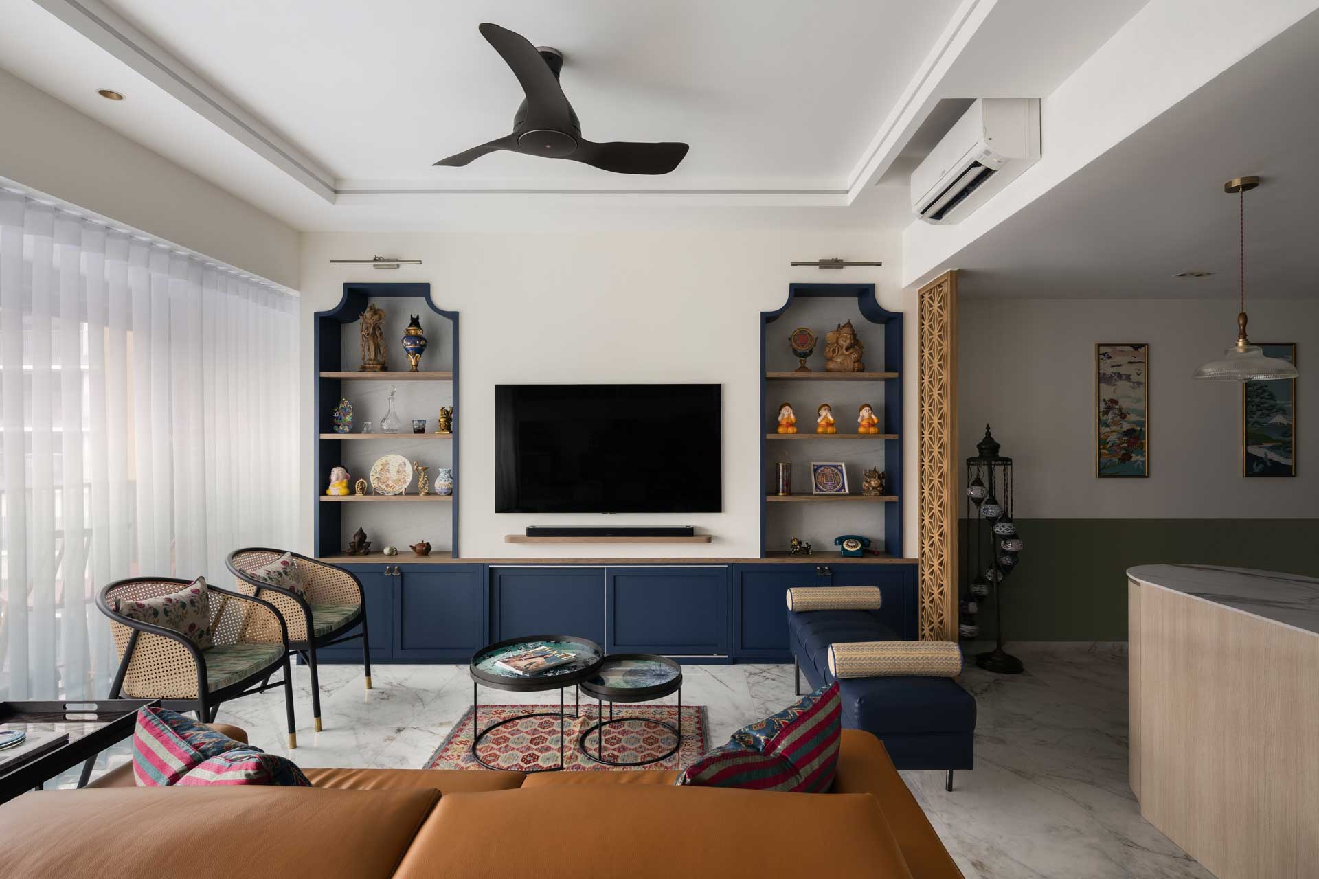
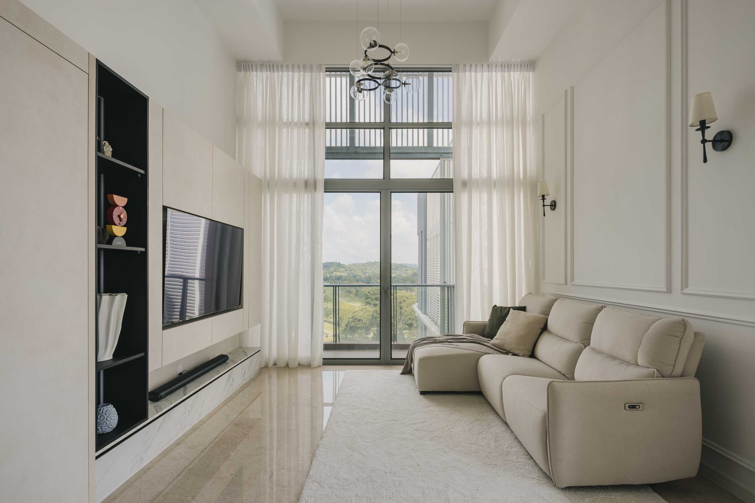
- Choosing the right colour palette is a crucial step in any interior design renovation, as it significantly impacts the mood, functionality, and overall aesthetic of a home. Understanding the function of each space is essential because colours should support the intended activities and atmosphere. For example, calming tones are ideal for bedrooms, bright neutrals work well in kitchens, and soft shades can make houses feel more spacious and inviting, creating a spa-like atmosphere. Aligning colours with each room’s purpose ensures that the home is both functional and visually appealing.
- Lighting conditions play a major role in how colours appear. Natural sunlight and artificial lighting can significantly alter the perception of a colour, so it is essential to test samples under various lighting conditions throughout the day. This step ensures that the chosen palette maintains its intended appearance and enhances the ambience of each room.
- Selecting a base colour sets the foundation for the interior design. Light neutral colours, such as white, greige, or soft grey, provide versatility and help make rooms feel larger, while warm tones create cosiness, and cool tones enhance serenity. The base colour influences how accent colours, furniture, and décor elements will interact in the space, so careful consideration is necessary to achieve balance and cohesion.
Tips on How to Choose the Right Colour Palette for Your Renovation Interior Design
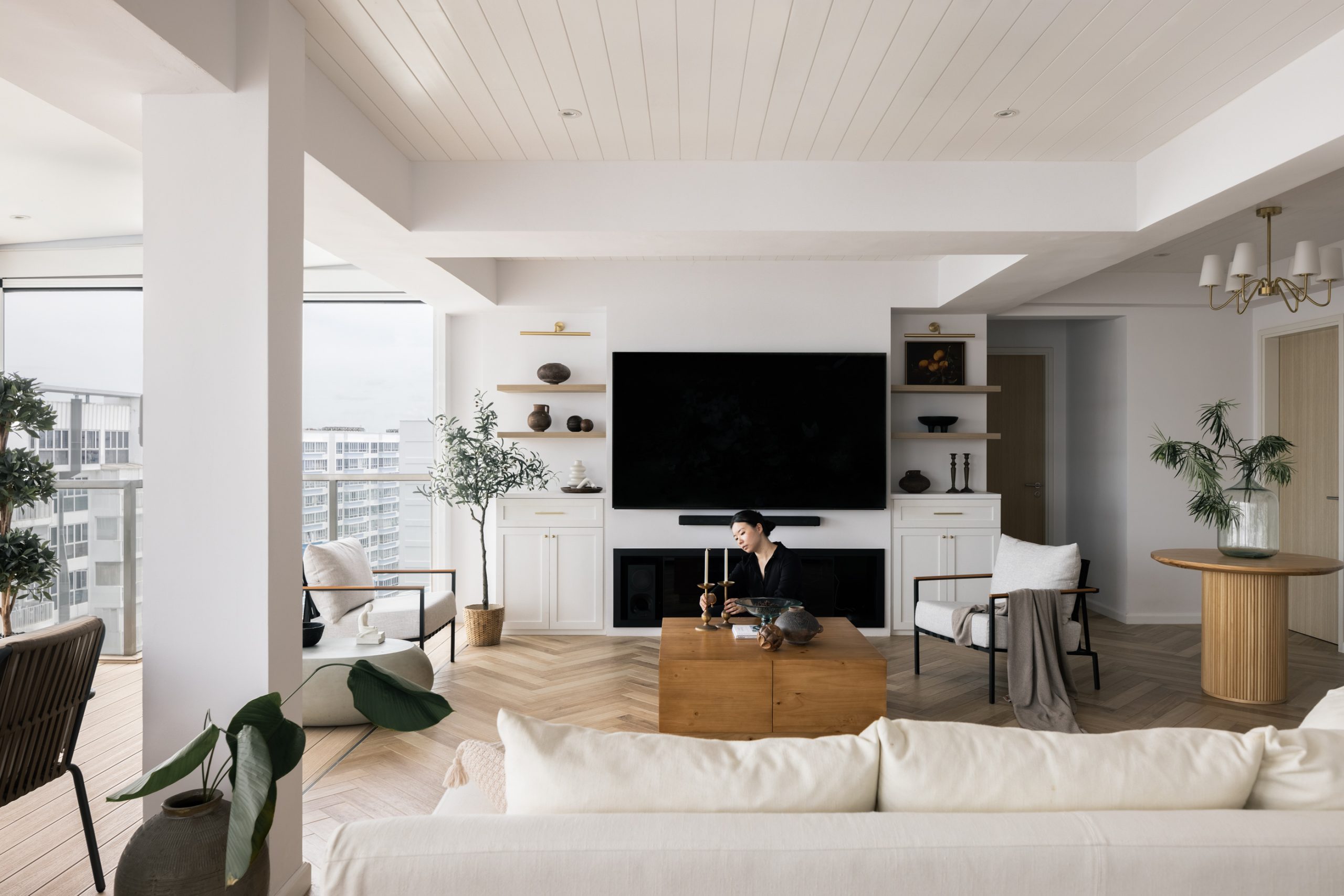
Choosing the right colour palette is one of the most important aspects of renovation interior design. Colours affect space perception, mood, and overall aesthetic, making them especially critical in Singapore’s compact homes.
Understand the Function of Each Space in Your Renovation
Before selecting colours for your home renovation, it is essential to analyse the purpose of each room. Functionality should guide your interior design decisions, including colour choices, lighting, and materials, ensuring that each space supports its intended activities and mood.
How Function Influences Colour Choices
|
Room Type |
Recommended Colours |
Purpose & Benefits |
|
Bedroom |
Soft neutrals, pastels, muted blues or greens |
Creates a calming and relaxing atmosphere, promoting restful sleep |
|
Living Room |
Warm neutrals, soft greys, accent colours (mustard, teal) |
Encourages social interaction, comfort, and a welcoming environment |
|
Kitchen |
Bright neutrals, whites, light yellows |
Promotes cleanliness, energy, and a fresh, inviting vibe |
|
Home Office / Study |
Cool blues, greens, or muted greys |
Enhances focus, concentration, and productivity |
|
Bathroom |
Light neutrals, soft blues, whites |
Enhances brightness and perception of space, creating a spa-like feel |
|
Children’s Room |
Playful hues like pastel pinks, blues, and yellows |
Encourages creativity and a lively, cheerful atmosphere |
Understanding the function of each space is crucial for selecting the right colour palette in home renovations. By tailoring colours to the purpose of each room: calming tones for bedrooms, bright neutrals for kitchens, and focused shades for workspaces, you can create a home that is both functional and aesthetically pleasing, aligning with your lifestyle needs.
Consider Lighting Conditions When Choosing Colours
Lighting plays a crucial role in interior design, affecting how colours are perceived and experienced. Both natural sunlight and artificial lighting can significantly impact the appearance of paint, fabrics, and finishes, making it essential to consider lighting when selecting your colour palette.
Key Benefits of Considering Lighting
- Accurate Colour Selection – Ensures the chosen palette looks as intended under all lighting conditions.
- Enhanced Ambience – Correct lighting highlights design features and improves mood.
- Improved Cohesion – Harmonises natural and artificial light with the chosen colour palette for a consistent look.
- Better Practicality – Prevents the disappointment of colours appearing differently than expected once the room is fully furnished and lit.
How Lighting Affects Colour Perception
|
Type of Lighting |
Effect on Colours |
Tips for Small & Bright Spaces (Singapore) |
|
Natural Light |
Changes throughout the day: morning light enhances cooler tones, afternoon light emphasizes warmer tones |
Test colours in the room during different times to see how shades shift with sunlight |
|
Artificial Light |
Colour temperature varies: warm lighting (yellowish) softens colours, cool lighting (bluish) intensifies hues |
Use lighting similar to your everyday usage when testing colours, e.g., LED ceiling lights or task lighting in kitchens and bathrooms |
|
Combined Lighting |
Mix of natural and artificial light may affect colour consistency |
Observe how colours appear at different times and under different lighting setups |
Considering lighting conditions is essential for successful interior design in Singapore homes. By testing colours under both natural and artificial light, observing shifts throughout the day, and accounting for bright tropical sunlight, you can select a colour palette that appears vibrant, cohesive, and harmonious in any room, thereby creating a comfortable and visually appealing space.
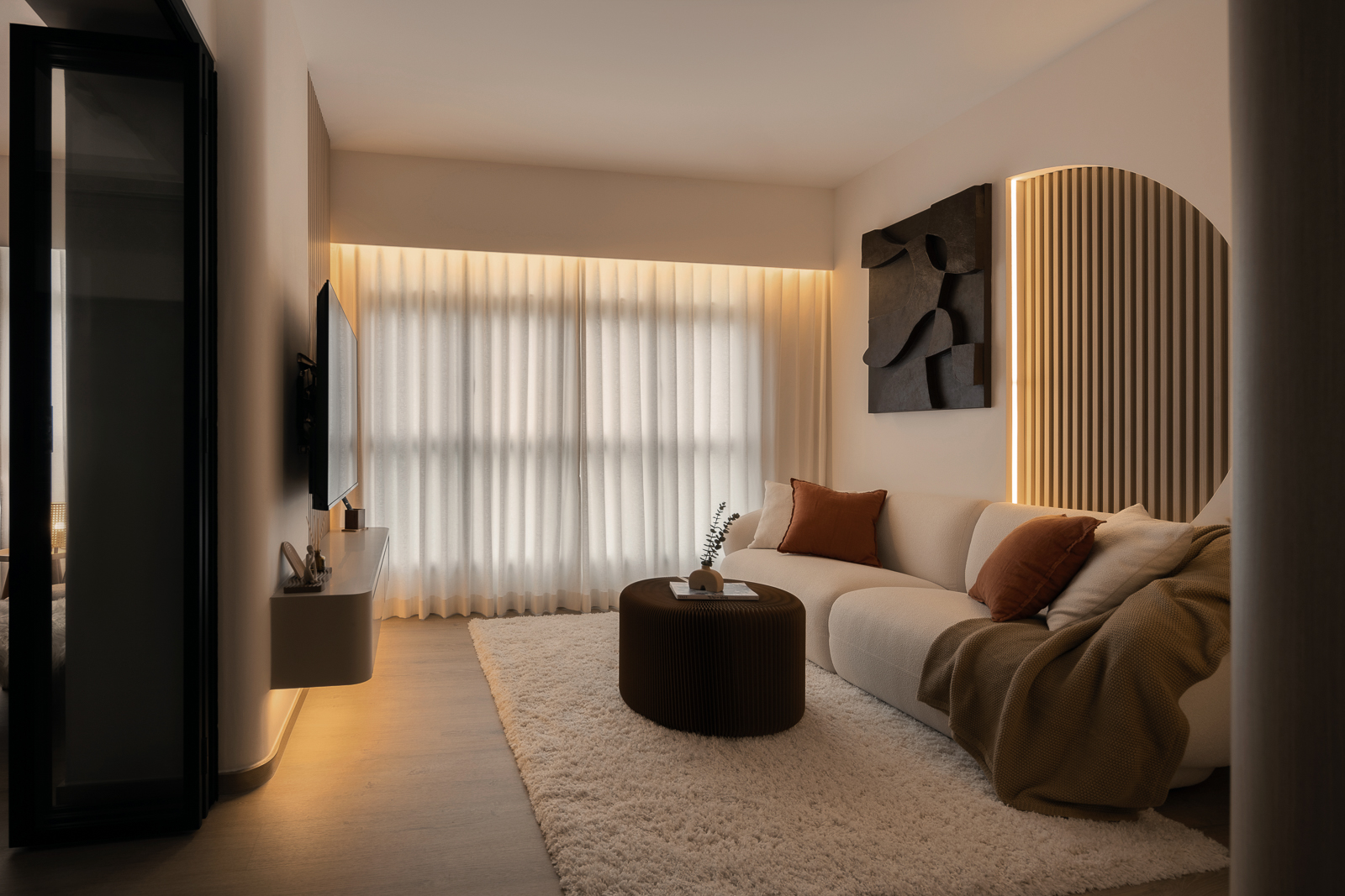
Choose a Base Colour for Your Renovation Interior
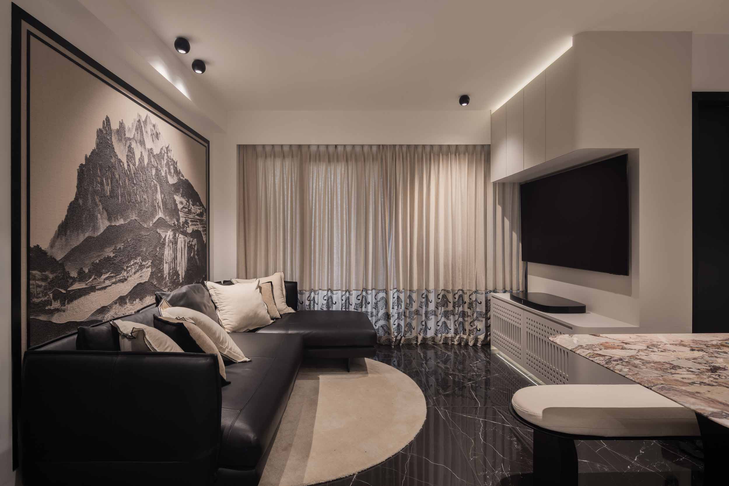
Selecting a base colour is a crucial step in interior design, as it serves as the foundation for walls, floors, and larger areas. The base colour sets the tone of the room, influences the mood, and determines how accent colours and décor elements will complement the space.
Tips for Selecting a Base Colour
- Start with Neutral – Light neutrals, such as white, greige, or soft grey, provide versatility and make rooms feel larger.
- Consider Warm vs. Cool Tones – Warm tones (beige, soft yellows) create a sense of cosiness; cool tones (blues, greens, greys) enhance calmness and spaciousness.
- Match Room Function – Select colours that suit the purpose of the space (e.g., calming tones for bedrooms, energising hues for kitchens).
- Test Under Lighting – Observe how the colour appears under both natural and artificial lighting throughout the day.
- Think Ahead for Accents – A neutral base allows flexibility with accent walls, décor, and furniture, ensuring a cohesive look.
Recommended Base Colours by Room
|
Room |
Suggested Base Colours |
Benefits & Notes |
|
Living Room |
Light grey, greige, deep navy, burgundy |
Neutral tones provide versatility; deeper shades add warmth for entertaining and relaxing. |
|
Bedroom |
White, light grey, beige, sage green, mint green |
Promotes calm and restful environment; earthy tones enhance relaxation. |
|
Kitchen / Dining Room |
Warm neutrals, lemon yellow, soft orange |
Stimulates appetite and energy; creates a welcoming and lively atmosphere. |
|
Bathroom |
Soft whites, pale blues, light grey |
Enhances brightness and perception of space; reflects light for airy feel. |
|
Home Office / Study |
Cool blues, muted greens, soft grey |
Supports focus and concentration while maintaining a professional environment. |
Practical Advice
- Balance Warm and Cool Tones – Use warm colours to create a cosy atmosphere and cool colours to promote serenity.
- Maintain Cohesion in Mind – Ensure that base colours across adjacent rooms complement each other for a seamless flow.
- Layer Accents Strategically – Once a base colour is set, add accent walls, furniture, or décor items to create depth and personality.
- Consider Functionality and Mood – Align colour choice with the activities and energy you want in each space.
Choosing the right base colour forms the foundation of a harmonious and functional interior. By selecting colours that reflect the room’s purpose, balancing warm and cool tones, and testing under different lighting conditions, homeowners in Singapore can create spaces that feel inviting, spacious, and stylish, while providing flexibility for accents and décor.
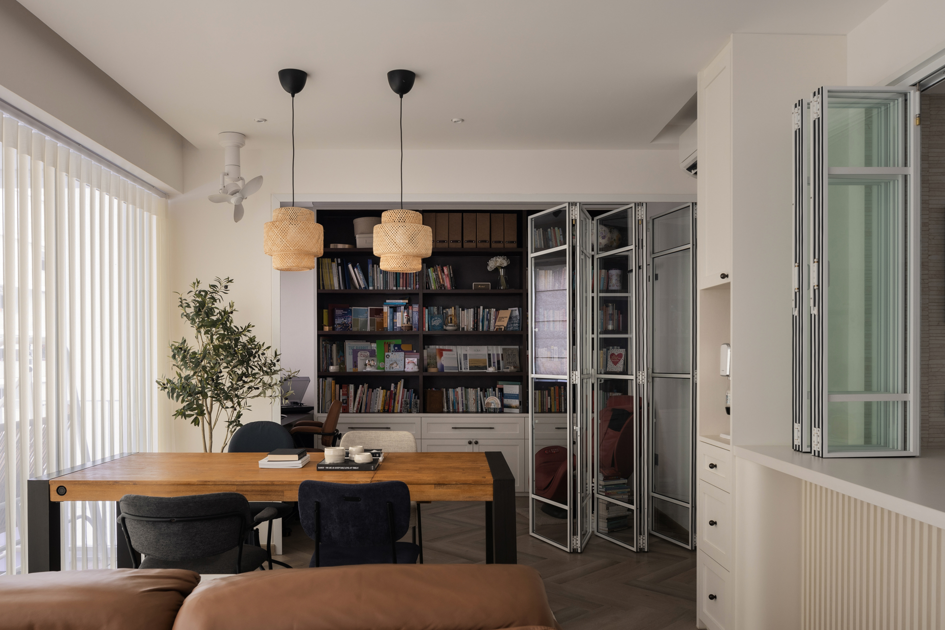
Align Colours with Furniture and Décor
Creating a cohesive interior requires coordinating your colour palette with furniture, flooring, and décor elements. The proper alignment ensures harmony, enhances your design, and highlights key pieces in your space.
Key Guidelines for Coordination
- Consider Existing Furniture – Match or complement the colours of sofas, beds, cabinets, or other significant furniture pieces.
- Include Flooring & Wall Treatments – Wood tones, tiles, carpets, and wallpapers influence how colours appear and should be factored into your palette.
- Highlight Signature Pieces – Artwork, sculptures, or statement furniture can guide accent colour choices.
- Balance Bold and Neutral Elements – Use bold accent colours sparingly if furniture or décor already has strong hues to prevent visual clutter.
- Repeat Colours Across Elements – Carry colours from cushions to rugs, curtains, or artwork for consistency.
Coordinating Colours with Décor Examples
|
Room / Element |
Base Colour |
Accent Colour |
Décor Tips |
|
Living Room |
Soft grey walls |
Emerald green cushions |
Pull accent colour from artwork or throw blankets to tie the room together |
|
Bedroom |
Light beige walls |
Sage green bedding |
Incorporate accent in curtains, lamps, or wall art for cohesion |
|
Dining Room |
Warm neutral walls |
Deep navy chairs |
Use table décor or wall features to echo accent colour |
|
Home Office |
Cool light grey |
Muted teal accessories |
Match desk accessories, shelving items, or curtains to create harmony |
Aligning your colour palette with furniture and décor ensures a harmonious and visually appealing interior. Thoughtful coordination enhances signature pieces, highlights key design elements, and creates a cohesive overall aesthetic that feels balanced, stylish, and reflective of your personal taste.
Test Samples and Mockups Before Finalising Colours
Testing paint samples or mockups is a crucial step in interior design, helping homeowners avoid costly mistakes and ensure the chosen colours work well in their space.
Practical Tips for Testing Colours
- Try Paint Swatches – Apply small patches of paint on walls to see how the colour looks on a larger surface.
- Use Digital Mockups – Interior design apps or software can simulate different colour schemes for your room.
- Observe at Different Times of Day – Check how colours appear under morning, midday, and evening light, as natural and artificial lighting can significantly alter the appearance.
- Small-Scale Tests – Test colours in a limited area before committing to full-room painting to reduce the risk of an expensive mistake.
- Consider Finishes – Matte, satin, or glossy finishes can alter how colours reflect light and influence room perception.
Benefits of Testing
- Ensures the colour matches your vision and complements existing furniture and décor.
- Reveals how lighting conditions affect perception, helping avoid unwanted hues.
- Reduces the likelihood of regret or additional repainting costs.
By testing paint swatches or digital mockups in your home, you can confidently choose colours that look beautiful and harmonious throughout the day. This step ensures your renovation achieves the desired aesthetic, mood, and functionality without costly surprises.
Practical Tips for Selecting Your Perfect Colour Palette
Choosing the perfect colour palette for your home can feel overwhelming, but with the right approach, it becomes an enjoyable and rewarding experience. A thoughtful colour palette sets the tone for your space, reflects your personality, and enhances the overall ambience of your home.
Here are key steps and practical tips to help you select the perfect palette.
1. Start with a Favourite Colour
Your favourite colour can serve as the foundation for your colour palette:
- Reflects your personal style and sets the tone for the room.
- Acts as the base for choosing complementary or contrasting shades.
- Ensures that the space feels uniquely yours and brings joy whenever you enter.
Tips for Using Your Favourite Colour:
|
Step |
Action |
|
Choose your base |
Pick your favorite colour as the primary tone for the room. |
|
Select complementary colours |
Use shades that harmonize with or contrast your base colour for depth. |
|
Include varied tones |
Mix light, medium, and dark tones of your favorite colour for visual interest. |
Starting with a colour you love makes the design process easier and ensures cohesion throughout your home.
2. Use Online Tools for Inspiration
Leverage colour scheme generators and design apps to explore combinations:
- Discover new colour pairings you may not have considered.
- Visualise how different colours look together in a room setting.
- Experiment with palettes before committing to paint or furnishings.
Popular Tools to Try:
- Canva Colour Palette Generator
- Adobe Colour Wheel
- Coolors.co
These tools make it simple to test colour combinations and find the perfect palette that resonates with your style.
3. Apply the 60-30-10 Rule
The 60-30-10 rule is a proven guideline to create balanced and visually appealing interiors:
|
Percentage |
Purpose |
Example |
|
60% |
Dominant colour |
Walls, large furniture pieces |
|
30% |
Secondary colour |
Upholstery, rugs, smaller furniture |
|
10% |
Accent colour |
Cushions, artwork, decorative items |
Benefits of the 60-30-10 Rule:
- Ensures a harmonious colour balance.
- Adds points of interest without overwhelming the space.
- Helps maintain a clean, minimalist, and professional look.
By following this rule, you can create interiors that feel polished, cohesive, and reflective of your personal taste.
Choose the Perfect Colour Palette with The Interior Lab, Experts in Renovation Interior Design
Selecting the right colour palette is one of the most crucial steps in achieving a successful interior design for your renovation. With The Interior Lab, you gain access to a team of experts who understand how colours influence mood, enhance spatial perception, and bring harmony to your home. Whether you prefer calming neutrals, bold contrasts, or timeless classics, they guide you in curating a palette that reflects your personality while complementing your space.
By combining design expertise with a keen eye for detail, The Interior Lab ensures your renovation project results in a home that feels cohesive, stylish, and uniquely yours. Their tailored approach seamlessly blends colour and function into walls, furniture, and accents.
Contact The Interior Lab today and let their renovation interior design specialists help you choose the perfect colour palette to redefine your living space.
Frequently Asked Questions
How does lighting affect the perception of colours in a room?
Lighting has a significant impact on how colours appear in a space. Natural light changes throughout the day, highlighting cooler tones in the morning and warmer hues in the afternoon. Artificial lighting, such as warm or cool LED bulbs, can significantly alter the appearance of colours on walls, furniture, or décor. When planning your interior design, consider how different lighting conditions will interact with your chosen colours to create the desired ambience.
What are the primary, secondary, and tertiary colours?
Primary colours are red, blue, and yellow, which cannot be created by mixing other colours. Secondary colours are green, orange, and purple, which are made by combining two primary colours. Tertiary colours are created by mixing a primary and a secondary colour, resulting in shades such as red-orange, blue-green, and yellow-purple. Understanding these categories helps in building diverse and visually appealing colour palettes.
How can I create a harmonious colour scheme for my home?
A harmonious colour scheme balances colours so that they complement each other naturally. Use the colour wheel to select complementary colours (opposites on the wheel), analogous colours (adjacent colours), or triadic colours (three evenly spaced colours). Combining these strategies ensures a cohesive and visually appealing design that feels balanced and inviting.
What is the 60-30-10 rule in interior design?
The 60-30-10 rule is a guideline for achieving a balanced colour distribution. Use 60% for a dominant colour, often applied to walls or large furniture pieces; 30% for a secondary colour, such as sofas or accent walls; and 10% for an accent colour, like throw pillows or decorative pieces. Following this rule helps create harmony and prevents any single colour from overpowering the space.
How can I incorporate accent colours into a neutral base?
Accent colours can bring life and personality to a neutral base. Use textiles, artwork, cushions, rugs, or décor pieces in bold or vibrant shades to add interest. Be sure to maintain balance by not overwhelming the neutral tones. Strategically placing accents throughout the room can create focal points and draw attention to key areas, resulting in a dynamic yet harmonious space.
CONSULT OUR DESIGNER
-
30 January 2026 TIPS & GUIDES
Best Lighting Layouts for Small and Dark Kitchens: A Guide to Kitchen Interior Design in Singapore
-
30 January 2026 TIPS & GUIDES
What Makes a Home Look Premium? Best Interior Design Ideas for a High-End Aesthetic in Singapore
-
29 January 2026 PRE-RENOVATIONTIPS & GUIDES
Renovation in Singapore: Choosing Materials That Age Well in Singapore’s Climate
-
29 January 2026 DESIGN INSPIRATIONTIPS & GUIDES
How to Design a Home That Fits Your Lifestyle: Tips from a Singapore Interior Design Company
-
9 January 2026 TIPS & GUIDES
How to Achieve Privacy in Open-Concept HDB and Condo Homes
-
30 December 2025 DESIGN INSPIRATIONHOME TOUR
A Look Inside Our 2025 Homes